European Academy of Optometry and Optics
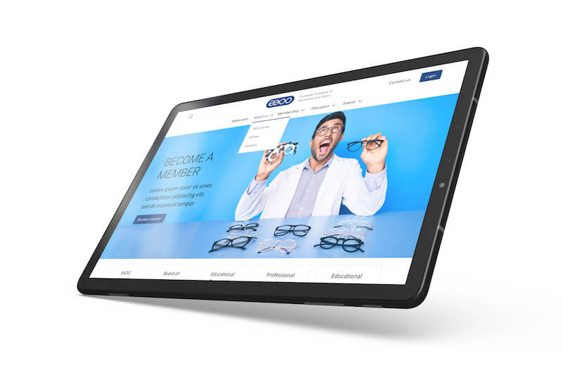
From a basic site to a global community hub, we transformed the EAOO website into a central spot where industry professionals meet, learn, and lead together.
The European Academy of Optometry and Optics (EAOO) stands as a beacon of knowledge, innovation, and networking in the optometry and optics field across Europe. Established in 2009, it continues to support, educate, and provide resources for professionals through its membership-driven organization.
United Kingdom
Health & education
2 months
Project management, Wireframing, Product design, Web development, Quality assurance
WordPress Development, Roots Sage & Bedrock, PHP, Stripe, HTML, JavaScript, SCSS, MySQL


Objective
Our main goal was to make EAOO's website better and more modern to improve how users experience it. We replaced the old site with a fresh one that is easy to use and offers a special area for members filled with learning resources like videos and documents. Making the process of becoming a member simpler was key, using online forms and different payment methods to save time. We also added "Academy Hour," a series of educational presentations, and updated the content system for easy edits by the EAOO team.
The old website was hard to use and unorganized, causing problems like poor navigation and missing important features. Our comprehensive makeover focused on making the site easier to navigate, faster, and more informative, especially for students and professionals in optometry. We aimed to make it clear and easy for visitors to understand what EAOO is about, how to join, and the benefits of being a member, all while attracting more people to the site.
Challenge
Our challenge was to prioritize website sections effectively, ensuring easy navigation and compliance with industry standards without compromising client needs. We aimed to design a website that not only met these standards but also fully catered to the diverse content requirements of the EAOO. Developing a straightforward membership application process was crucial, enabling administrators to manage members efficiently, from registration to approval. Additionally, we needed to create a members-only area, providing exclusive access to a wide array of educational materials. Balancing functionality, aesthetics, and user-friendliness was paramount in delivering a website that would serve as a valuable resource for years to come.
Our Approach
Discovery Meeting
We initiated the project with a discovery meeting, focusing on understanding the client's expectations, reviewing provided materials, brainstorming solutions, and sharing our initial ideas.
Low-Fidelity Wireframes
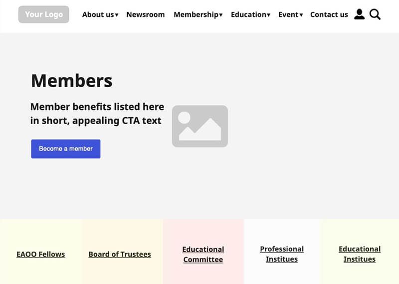
We crafted basic, low-fidelity wireframes for the majority of the pages, using them as a conversation starter to align with the client's vision and expectations, with the content serving as a guide for element placement and design.
Design
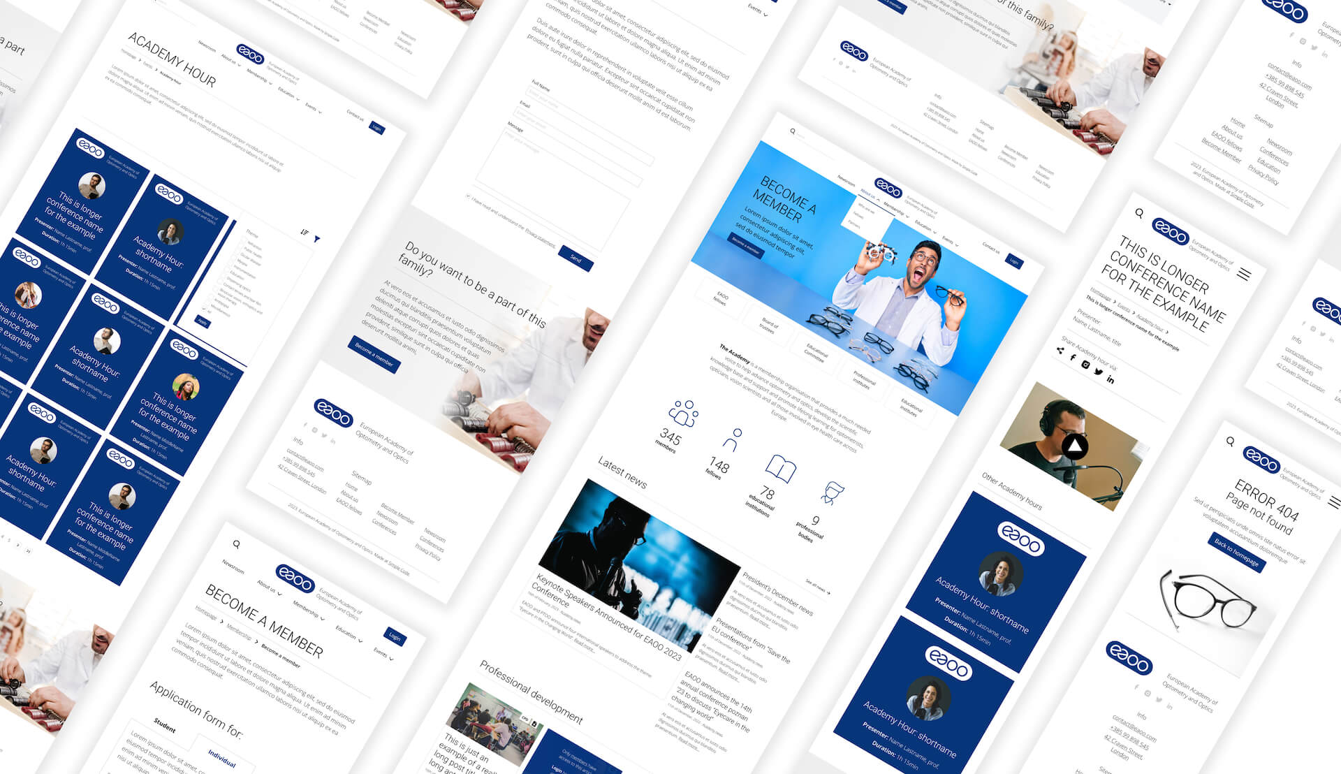
Transitioning from low-fidelity wireframes to high-fidelity designs, we established a minimal brand book and standards, selecting typography, colors, and spacing to shape the overall look and feel. This phase involved designing key pages first, then moving to secondary pages, all while incorporating client feedback.
Development
Our development phase involved transforming the design into a functional custom WordPress theme. We developed a style guide, defined CSS variables for consistency, and created various blocks, layouts, and components.
Feature Development
With the UI elements ready, we built the entire membership flow, including application, payment, approval processes, and a members-only area, ensuring a smooth and engaging user experience.
Content Management
We added and optimized the provided content, ensuring images and videos were optimized for quick load times.
Quality Assurance
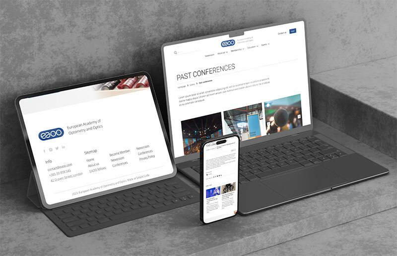
Rigorous testing across various devices ensured that every feature matched the design specifications and performed flawlessly.
Client Feedback
We incorporated the client's final feedback, making necessary adjustments and enhancements before the final launch.
Launch
The website went live after thorough checks, with all forms, payment systems, and members-only areas tested and fully functional.
Outcome
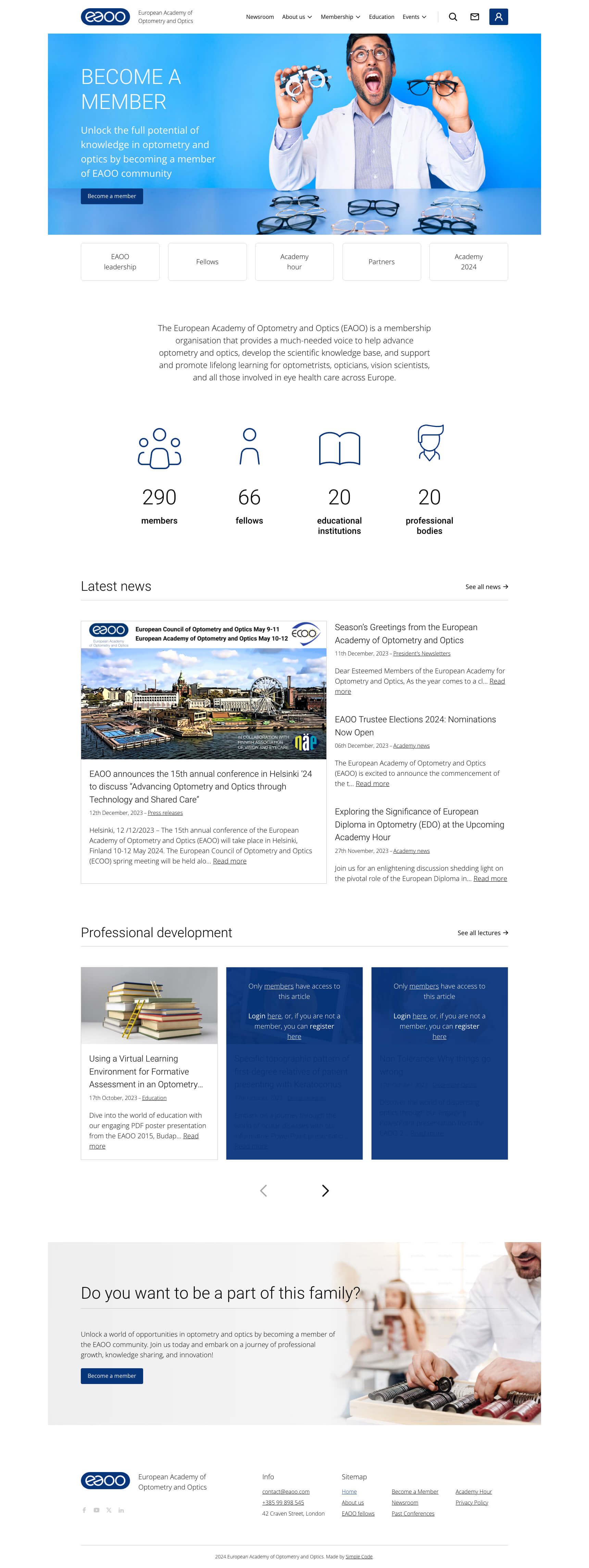
Launched a cutting-edge website for a comprehensive online learning experience.
Streamlined membership processes for ease and efficiency.
Implemented an intuitive content management system for seamless updates.
Boosted online visibility and reach through improved SEO strategies.
More Success Stories


