Simple Code Brand Transformation
We gave our agency a complete digital makeover – refreshed branding, an engaging new website, and a stronger social media presence to showcase our creativity and expertise in tech.
Based in Croatia, Simple Code is a digital agency that creates modern web and mobile solutions. Over the years, we’ve worked hard to deliver quality in every project, but our brand needed to show how much we’ve grown. This project was all about updating our look to match who we are today and making it easier to connect with clients and our community.
Croatia
Digital services
9 months
Graphic design, Branding and identity, Wireframing, UX/UI Design, Web development, Backend development, Quality assurance, Project management
Next.js, TypeScript, SCSS, Laravel, Vercel
Objective
Our goal was to refresh the Simple Code brand to better represent who we are today. This included creating a new logo, choosing bold new colors, redesigning the website, improving our social media presence, and introducing branded items. The website needed to show off our portfolio and services while being fast, easy to use, and visually appealing.
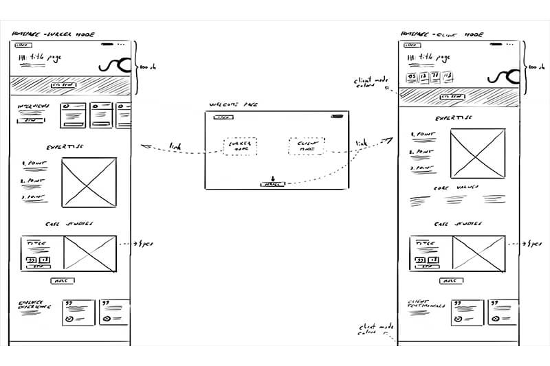
The biggest challenge was creating a brand and website that showed who we are – creative, professional, and innovative. We needed to combine design and functionality into a smooth experience. The website required two modes: one for clients and one for general visitors, each with its own style. It had to load quickly, work across all devices, and be easy to update in the future. Social media posts and branded items also needed to follow the new style for consistency.
1. Branding and Identity
Color Palette
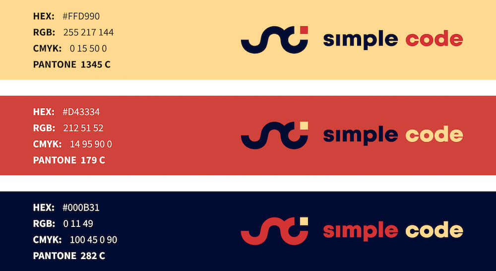
We chose three main colors to represent our creativity and precision: a warm yellow, a bold red, and a deep blue. These colors are used consistently across the website, social media, and promotional items.
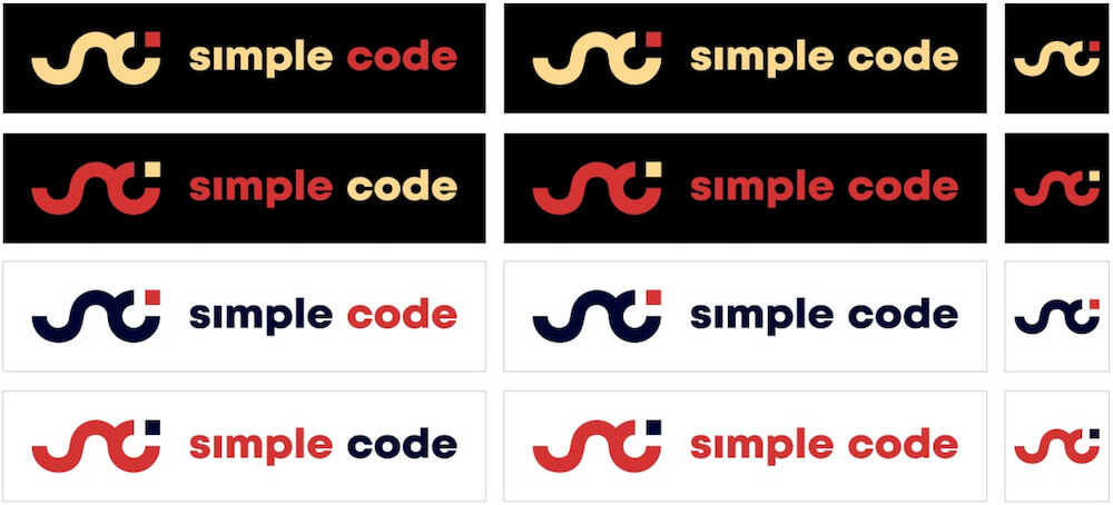
Combination of primary colors on black/white background:
Logo Design
Our new logo combines the letters "S" and "C" in a clean, modern way. It’s versatile enough to work alone or with text, making it easy to use on all platforms.

2. Graphic Design
Promotional Merchandise
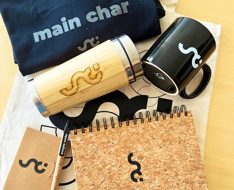
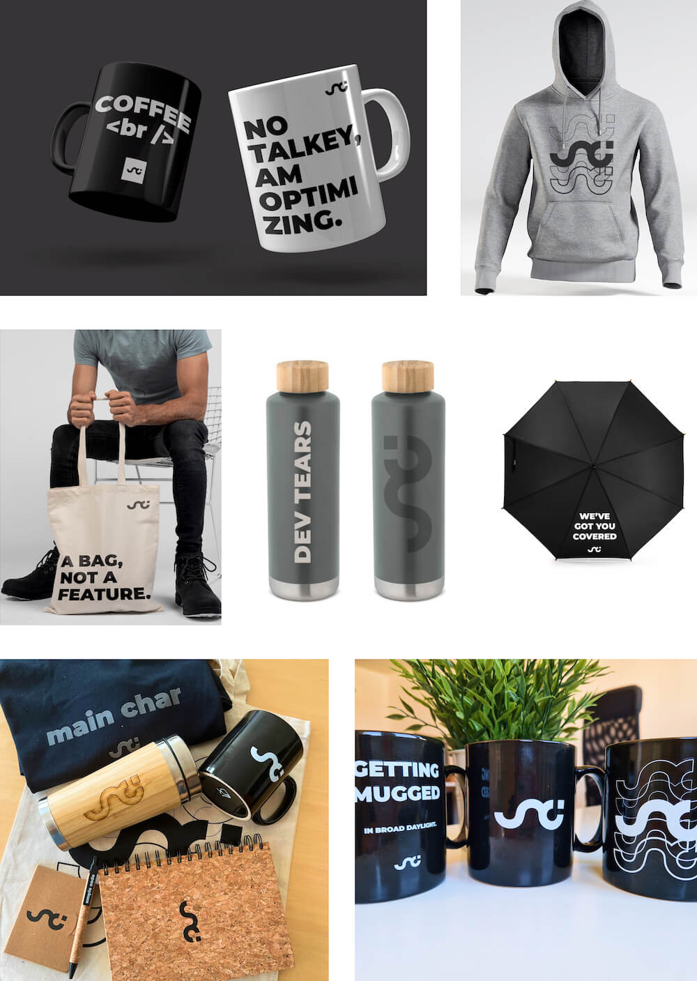
We created branded merchandise like mugs and hoodies. These items help strengthen our identity and connect with clients and the wider community.
Social Media Assets
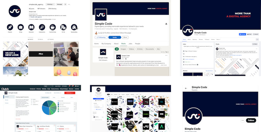
We redesigned our social media presence to match the new brand. Posts were grouped into themes like blog posts, team stories, and client insights. The updated logo and color scheme gave our Facebook, LinkedIn, and Instagram a consistent and professional look.
Showreel Video
We added a dynamic video to the website to highlight our projects and show our creative capabilities.
3. Web Design and Development
Website Research and Analytics
We studied how people used our old website to plan a better structure for the new one. The focus was on making the content easy to find and engaging.
Wireframing and Prototyping
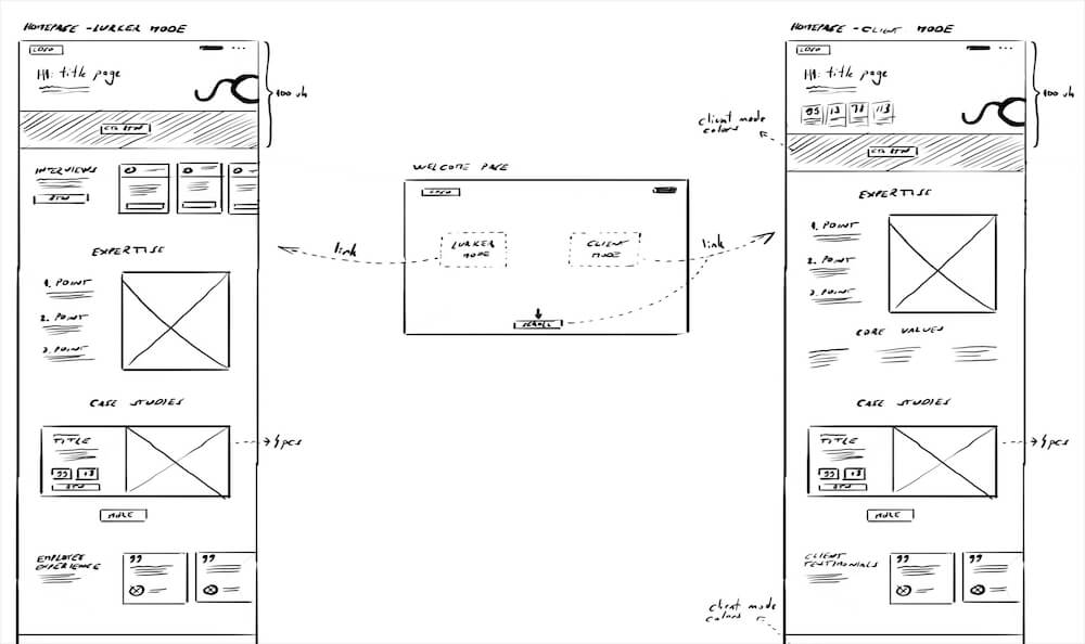
We started with hand-drawn sketches to map out every page’s layout. These sketches were turned into detailed wireframes to refine the design before development.
UX/UI Design
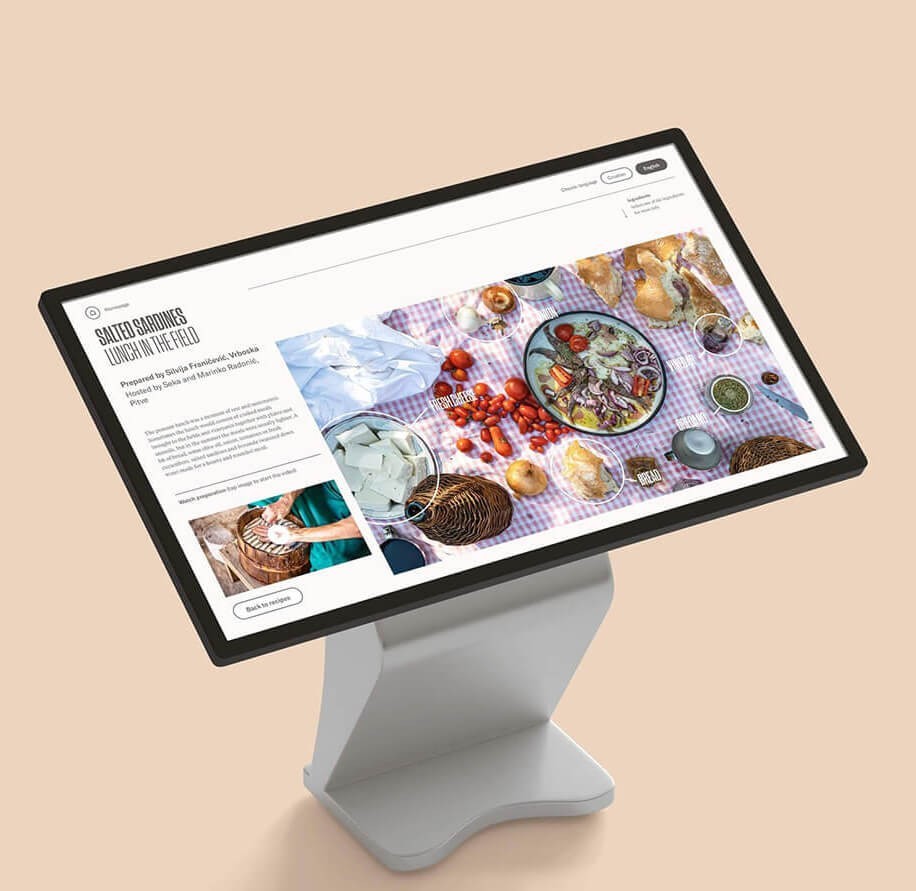
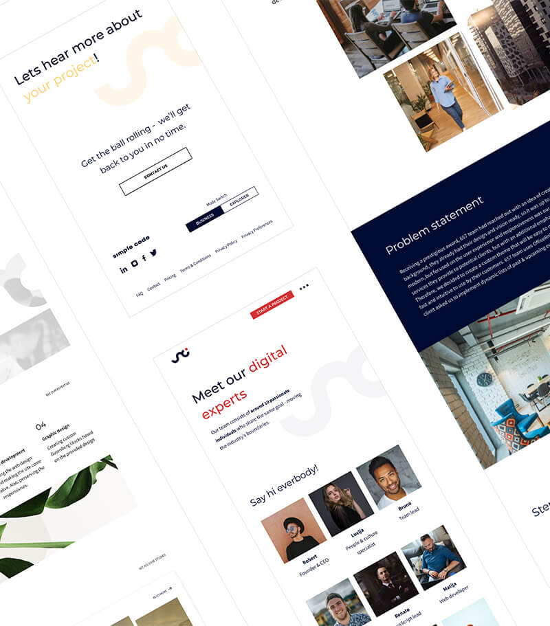
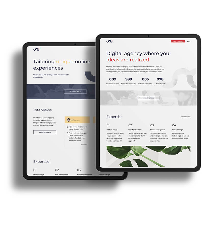
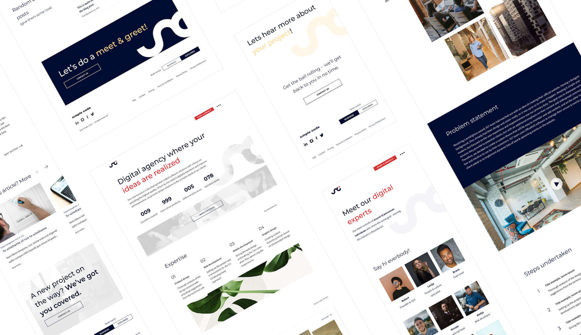
The new site is simple, modern, and content-driven. There’s no unnecessary clutter, and the text is kept short and clear. We added images, animations, and smooth transitions to make the experience more engaging. The site has two modes:
Client Mode: This mode uses blue as a background color and red as an accent. The design is light, clean, and professional, with shades of grey to keep it subtle.
Explorer Mode: This mode is for general visitors and uses yellow accents. The design is bolder and more vibrant but still easy to navigate.

Development
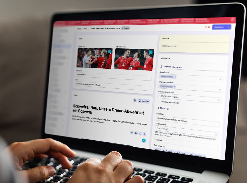
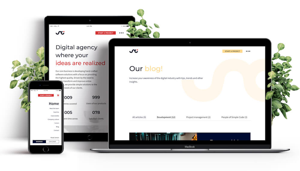
We built the site using Next.js for fast performance and reliability. Static site generation ensures quick load times, and a custom CMS built with Laravel makes updates easy. The website is fully responsive, working seamlessly on all devices, including ultra-high-resolution screens.
Final Result
After nine months, Simple Code has a fresh new look that reflects our growth and creativity. Our updated logo, bold colors, and modern website show who we are today.
The website is fast, easy to use, and works perfectly on all devices. It has two tailored modes for business clients and general visitors. Our redesigned social media posts and branded items help us connect with our audience and clients.
This transformation shows how we combine creativity and technology to create meaningful experiences, helping us build stronger connections and make a positive impact in the digital world.
More Success Stories


